Newsroom
October 6, 2026
Hinge's Ben Celebicic On Why Good Products Let You Leave
By Ben Celebicic (he/him), Chief Product and Technology Officer, Hinge

Before Hinge, before dating apps, and before the iPhone, I worked in tech at Abercrombie & Fitch. Early on, I spent a week working the store floor — folding shirts, talking to customers, watching what made them feel connected to the brand. I was there to build technology, but that week taught me something I've carried ever since: even working behind the scenes, you have to understand the person you're actually building for.
That same instinct applies at Hinge: we know you want to find someone, and hopefully leave us behind, which is why my goal is to get you off the app. That's an unusual goal for someone who runs product, but it has shaped almost every decision we've made over the last 11 years. It's why we call ourselves the app designed to be deleted. But building a product intentionally designed to let you leave takes a different kind of discipline, and it comes down to four things.
Define the Outcome Before You Build
Design For What Your User Needs, and Nothing More
Break the Big, Unsolvable Problem Into Small, Solvable Ones
Have the Discipline to Not Ship Features
1. Define the Outcome Before You Build
In 2015, our leadership team got in a room to decide the future of the product. At the time, Hinge was still built around mutual friend connections, matching you with people who shared a friend on Facebook, but it felt like every other dating app: a place for endless browsing rather than the meaningful connection we wanted people to find. From where we sat as a product team, we were feeding that game, chasing whatever feature a competitor had just shipped. We were part of the problem.
The decision we ended up making was to orient entirely around the user and their outcomes: Is what we’re building actually going to help two people meet in real life? Everything about the Hinge you see today traces back to that question, and every feature we build still gets tested against it.
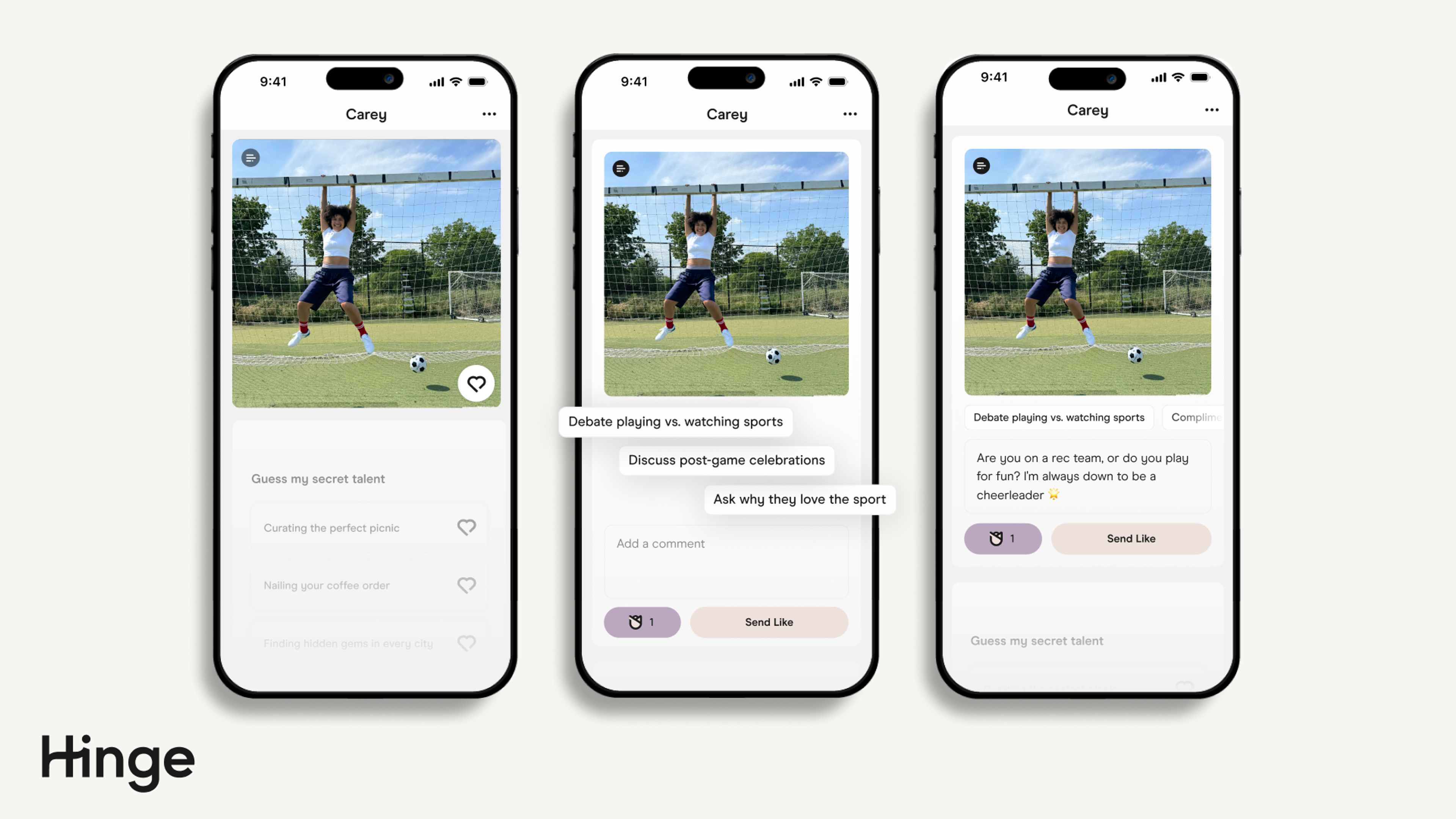
You can see it in the most basic mechanic of the app. On Hinge, you don't like a whole person. You like or comment on a specific photo or Prompt. That came straight out of the outcome question: if the goal is a date, a match has to become a conversation, and "this person likes me, now what?" is a dead end. Liking something specific gives both people a first thing to say. And people who take that opening do better: likes that come with a comment are twice as likely to lead to a date.
2. Design For What Your User Needs, and Nothing More
People use products to achieve something, and a product that helps them do so in the simplest form is good design. Take one of my favorite products: my Quip toothbrush. It has one setting and a two-minute timer. It does one job, does it well, and doesn't try to do anything more.
At Hinge, every feature gets held to the same test: does it do one thing well, or is it trying to do five things at once? Getting that wrong rarely shows up on launch day — every addition looks reasonable on its own, and most of them move some metric. But the cost adds up: each feature is one more thing every user has to step around, and one more thing engineers have to maintain, test, and build around for as long as it exists. Stack enough of them and the reason people came gets buried. You've used products like this, where the thing you opened it for is three taps deep, under things you never asked for. Nobody decided to make it worse. It got worse one reasonable feature at a time.
3. Break the Big, Unsolvable Problem Into Small, Solvable Ones
"Help two people meet" is too big to solve head-on. So we break the journey into steps: creating a profile, browsing, matching, chatting, planning a date, going on it. Then we break those down again. Chat alone splits into how you start a conversation, how you keep it going, and when you ask someone out.
Take keeping it going. More than four in 10 daters told us unresponsive matches were one of their biggest dating challenges, and as a result, many weren't making it to a date. Our hypothesis was decision paralysis: when you're juggling too many open conversations, you're more likely to answer none of them and put your focus elsewhere. So we built Your Turn Limits. If too many people are waiting on your reply, you can't send or receive new likes until you respond or end the conversation. Responsiveness went up 20%, and daters told us it made them more thoughtful about who they matched with.
Nobody designs that feature by staring at "help people date." It only shows up once the problem is small enough to see.
4. Have the Discipline to Not Ship Features
Every product team knows the pull of a feature it has spent months on.
We explored Introductions, an AI-powered note at the top of a profile that gave you more context about someone before you decided whether to connect. It was the shiny thing, and we'd spent more than six months building it. When the tests came back, we weren't seeing evidence that it would meaningfully improve the quality of connections or the overall dating experience. We chose not to ship it, and I'm proud of us for that. We made the same call on Photo Selector, which helped daters pick six profile photos straight from their camera roll. It was much faster, but daters consistently chose better photos for themselves than the feature did.
The work wasn't wasted. Both tests taught us something that's now core to how we think about AI at Hinge: it should be a guide, never a replacement for someone's own voice. Every AI feature we ship is held to that test. Convo Starters, for example, gives personalized suggestions for a first message but never writes it for you.
The bottom line: We've never had more technology between us and the people we want to know. The answer isn't less technology. It's technology that knows what it's for. At Hinge, success is measured by what happens after someone closes the app, not what happens inside it. The best products earn their exit: they help someone get what they came for, then step aside.