Mission & Values
End careless dating culture because we believe love is worth caring about.
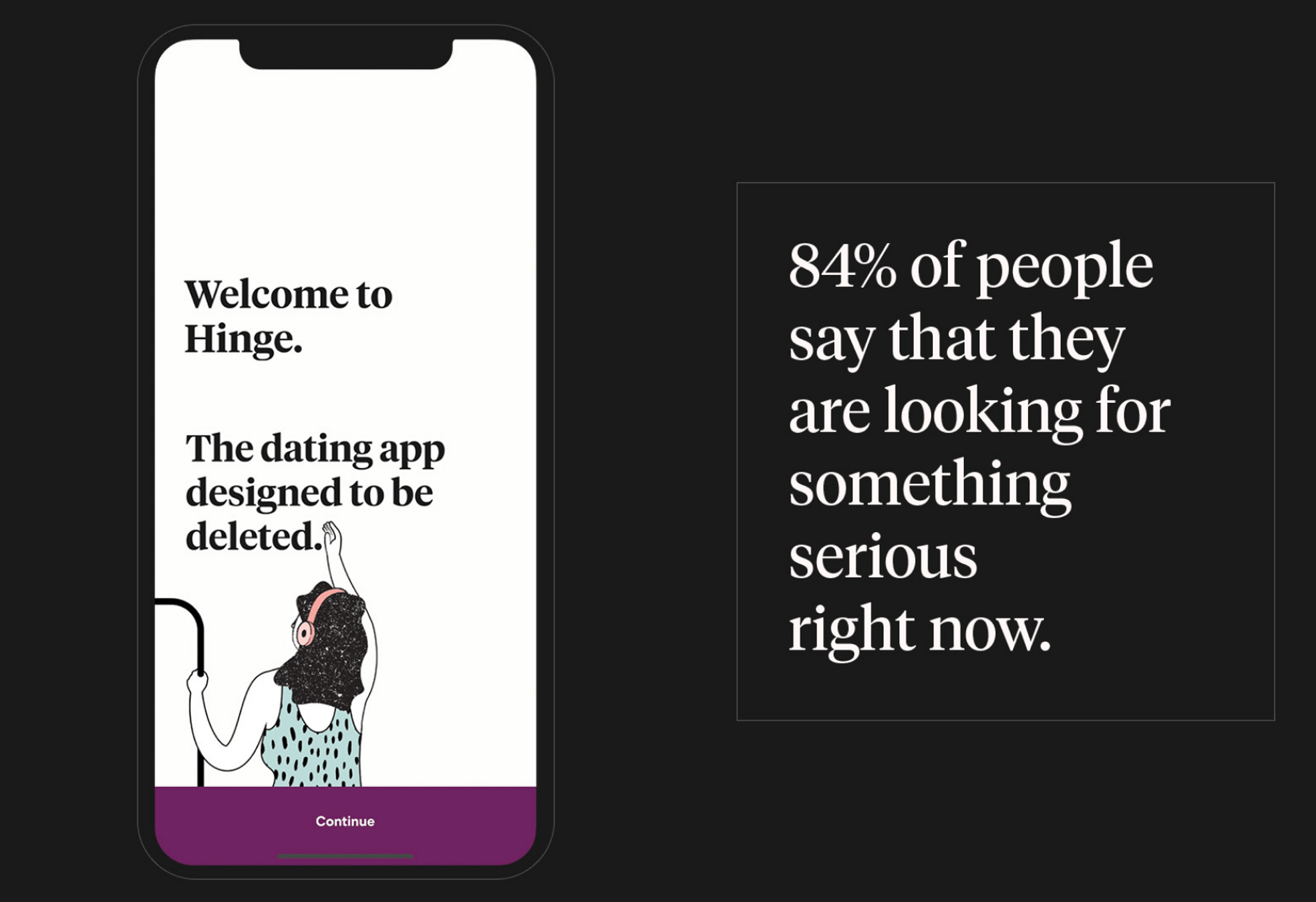
Hinge is the dating app designed to be deleted.
These are the four timeless adjectives which define how we present ourselves to the world. They direct who we are while leaving room for our work to evolve with culture.
Personable
We are warm, inviting, and caring.
Aesthetic
We are modern, intentional, and detail-oriented.
Insightful
We are practical, credible, and research-backed.
Hopeful
We inspire toward higher ideals.
Brand Marks
Our wordmark is how the brand first says hello. It's a bold, modern wordmark which is sophisticated, yet friendly.
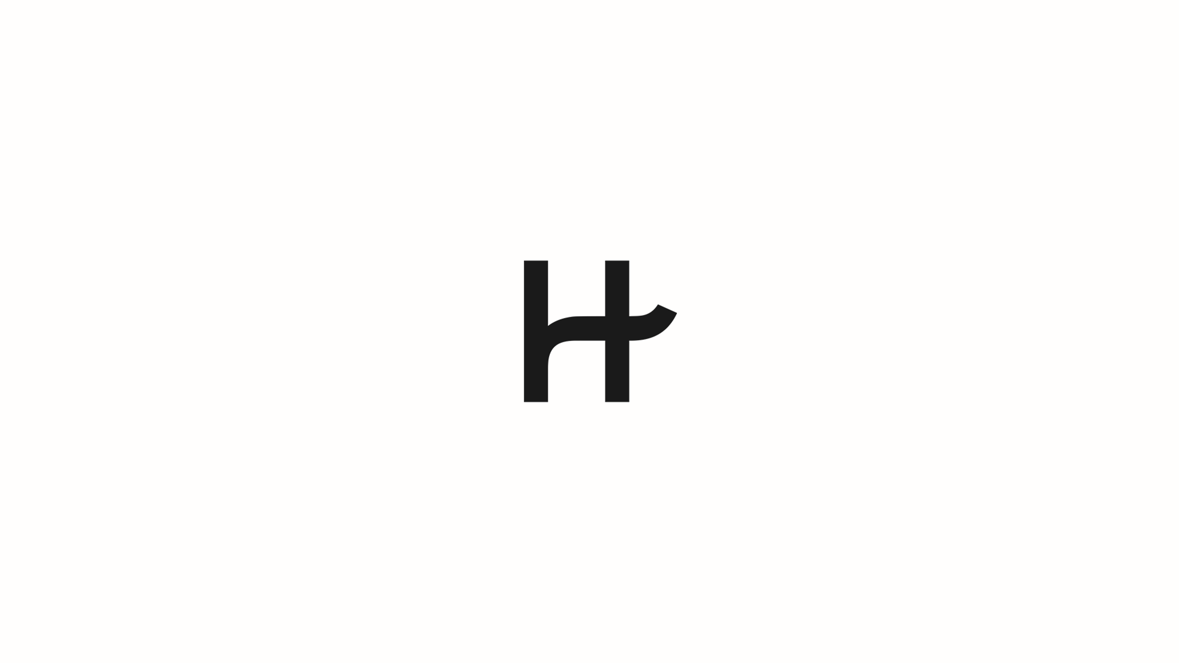
The ligature between the “H” and “i” alludes to the romantic journey while also highlighting the word “Hi”. Hello indeed.
Sometimes the H from Hinge must stand alone. This creates the Hinge lettermark which maintains the spirit of the wordmark. The lettermark is intended to be used where space and size are limited.
The lettermark is always used in lieu of the wordmark and never in conjunction.
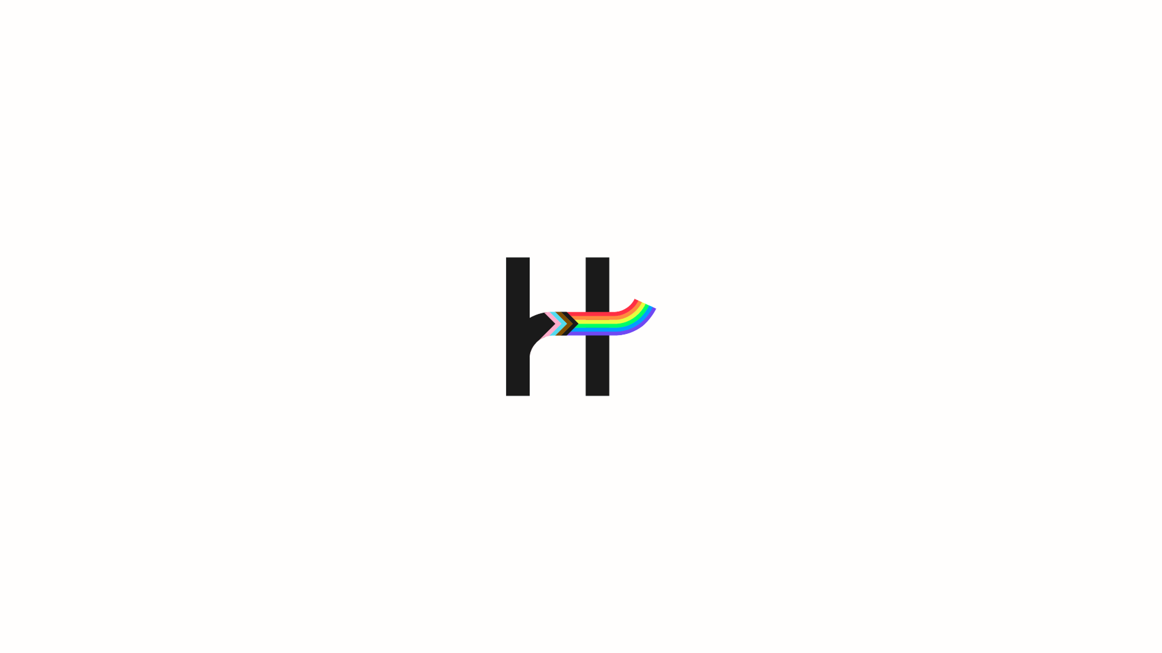
As an alternative to the standard lettermark, stylized Hinge lettermarks can be used if there is a clear purpose.
For example, an alternate lettermark can be created when its articulation reflects a core belief of our brand and culture — such as our Pride example to the right.
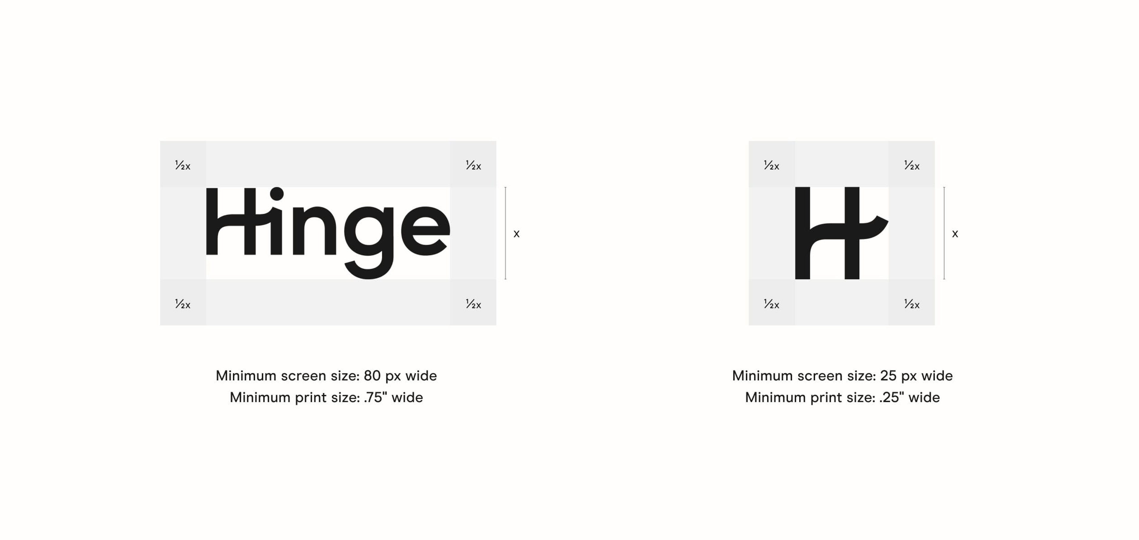
Both our wordmark and lettermark should never be scaled smaller than the minimum sizes provided to ensure readability.
Wordmark can be set in black or white over images or video with sufficient contrast.
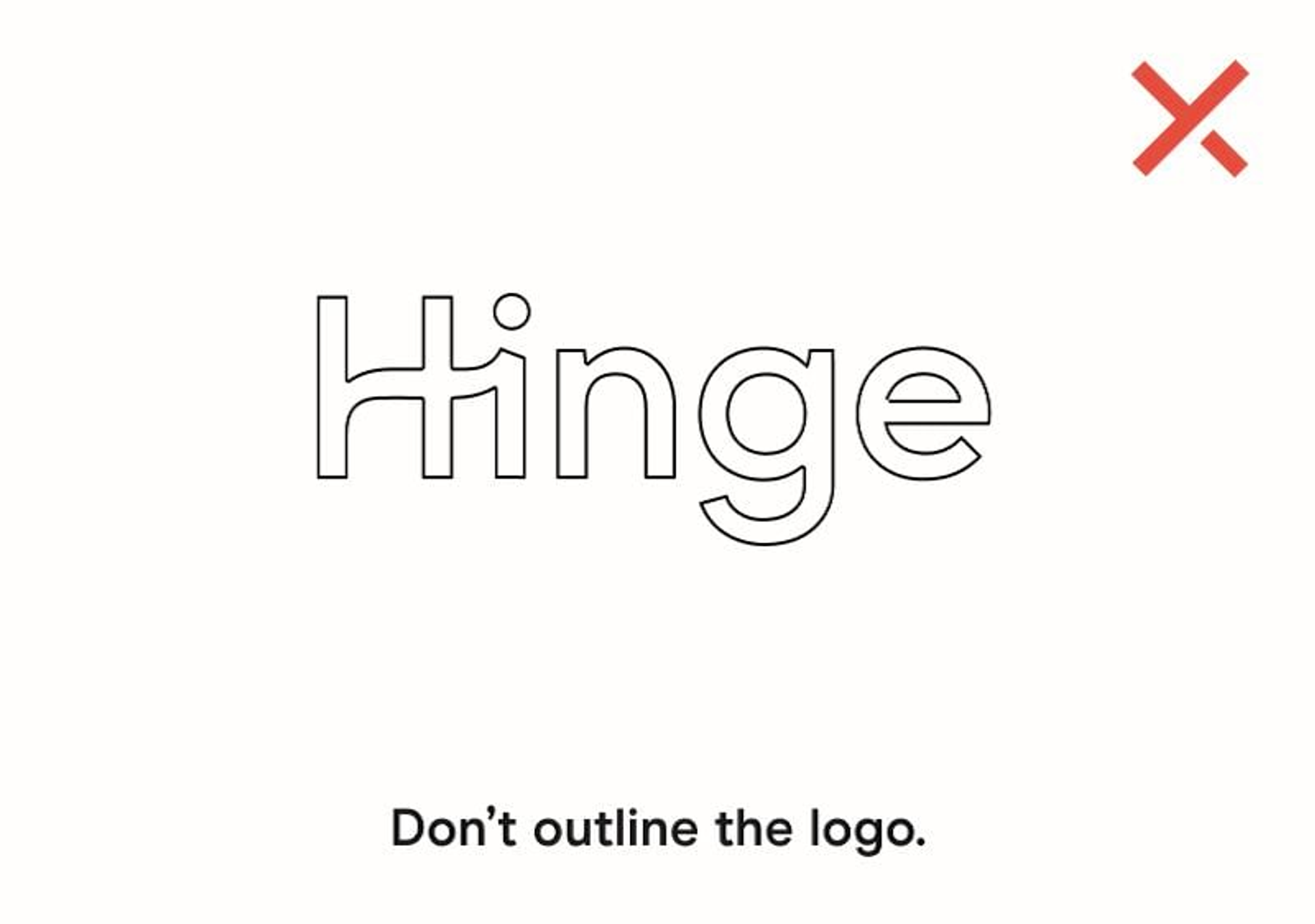
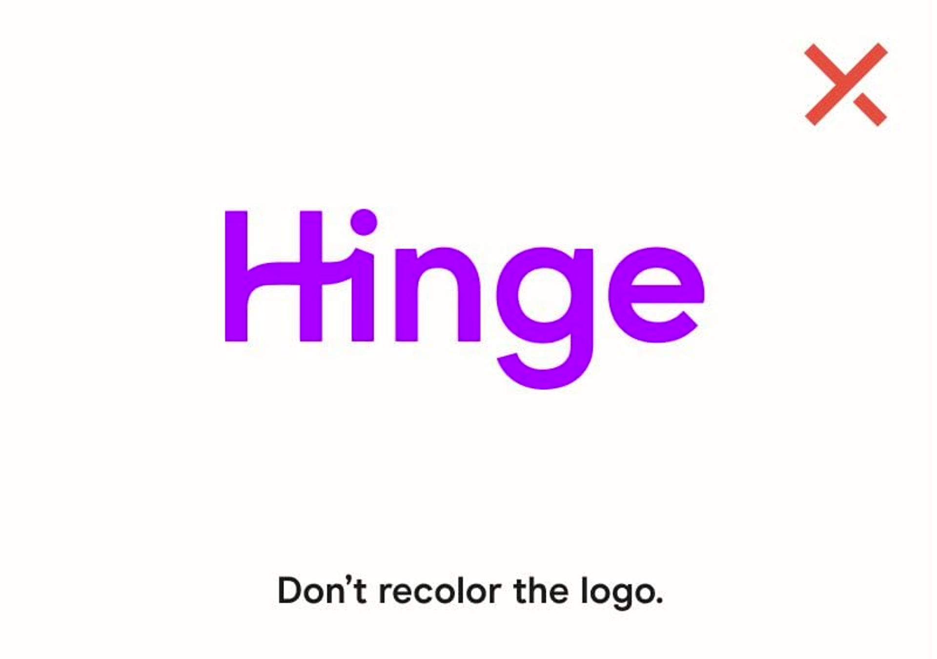
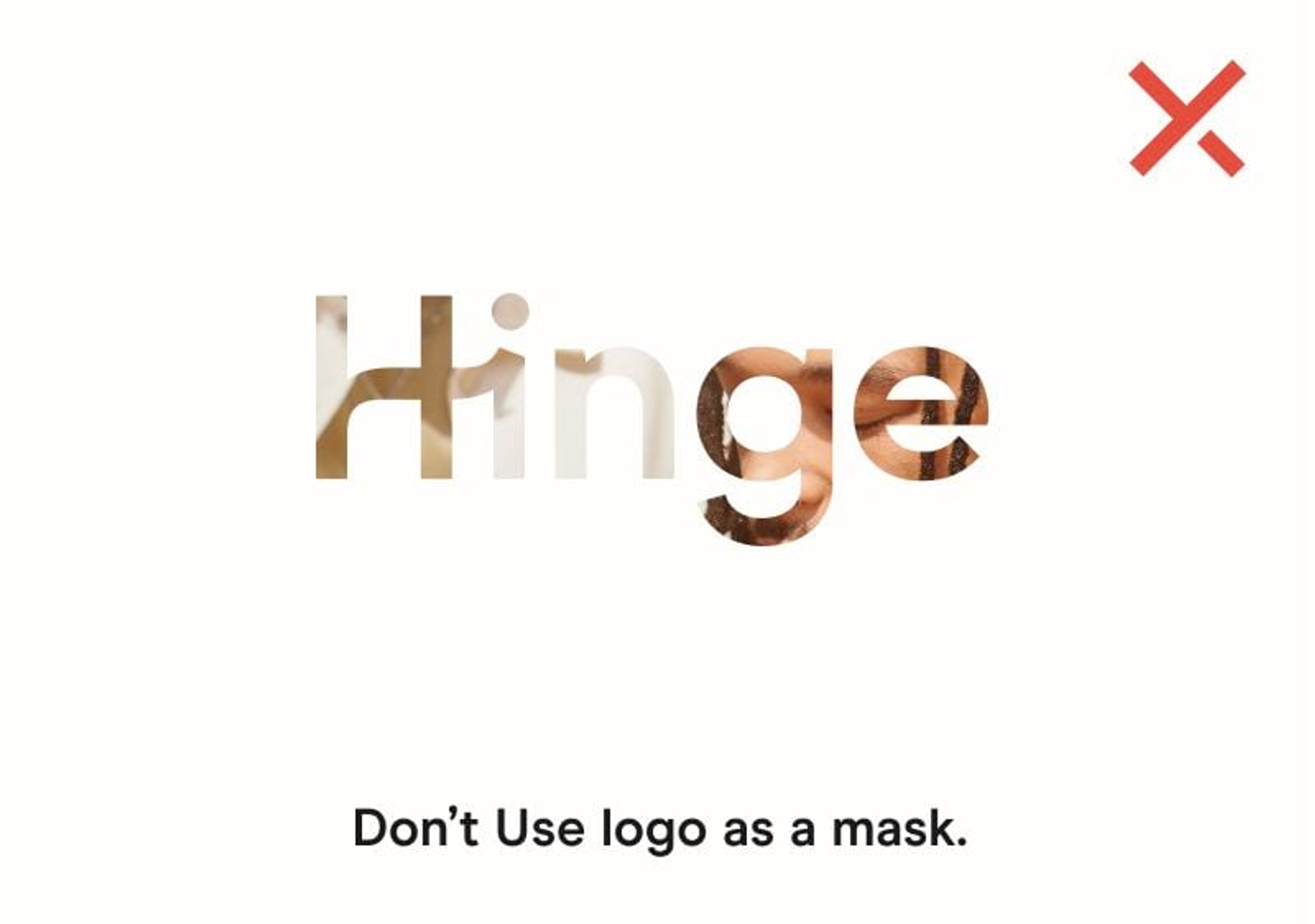
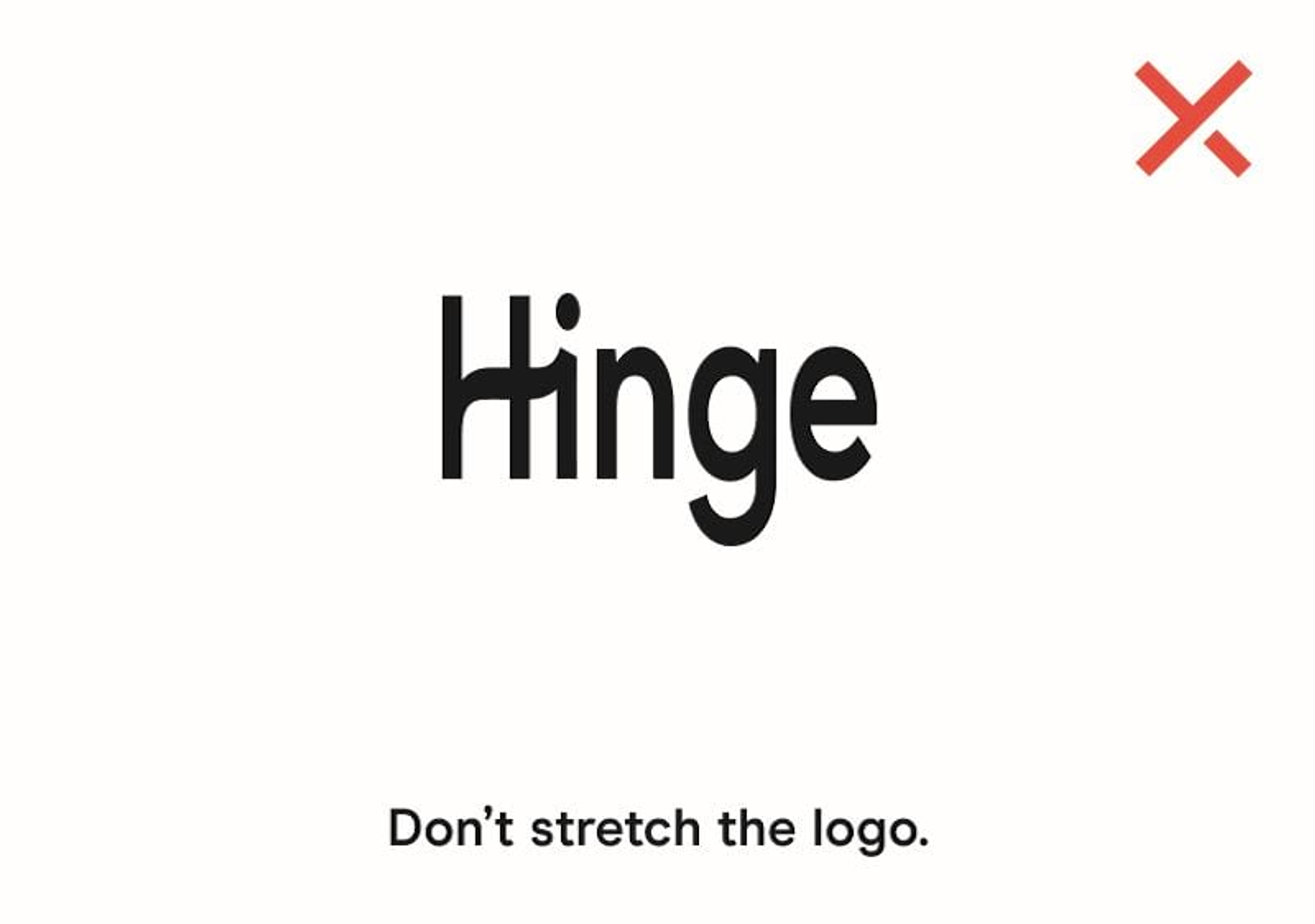
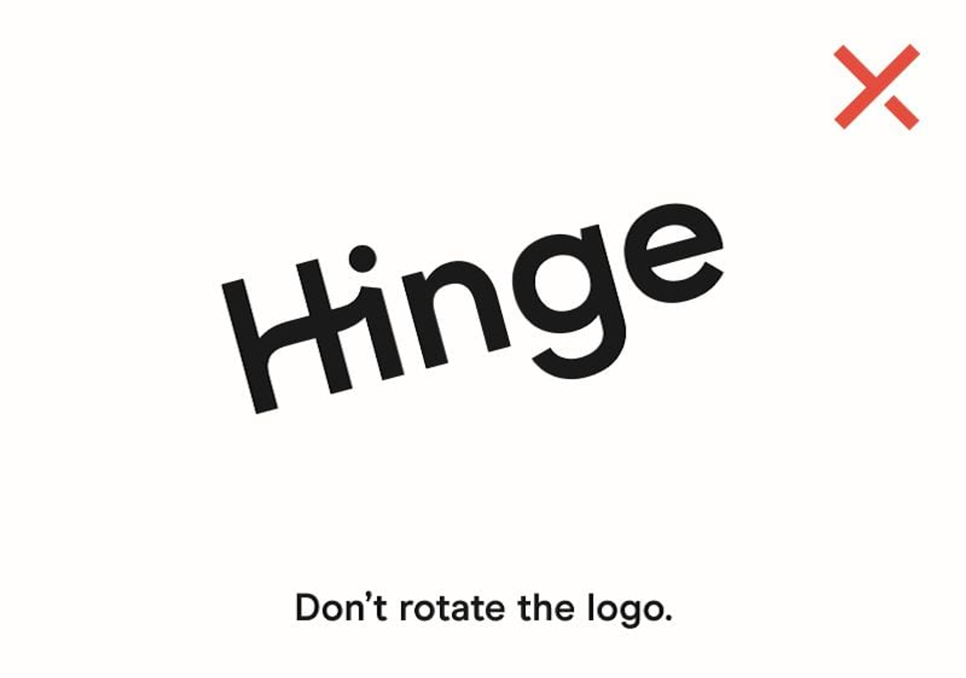
So let's talk about what not to do with our logo, since it's imperative the appearance of the logo remains consistent.
The logo should not be misinterpreted, modified, or added to. No attempt should be made to alter the logo in any way. Its orientation, color and composition should remain as indicated in this document.
These are the rules — and we did in fact make them.

Hinge's primary brand colors are black and white.
Black and white are the primary colors of the Hinge brand. They are intentionally not absolute in value to give them a more organic feel.
On Use of Color:
Our use of color is inspired by the outdoors because that’s where our members are — off the app.
The full palette extends from naturally occurring purples and greens to warmer reds and neutrals. The resulting palette portrays hues found in the natural world.
Note: Bright White is used only when operating systems require it.
Color distribution is essential throughout marketing and product.
Black and white should always be the predominant colors and appear in at least 90% of a given space. The rest of the palette should never occupy more than 10% of the space.
The obvious exception is when color photography is used. In that case, the principles of the simple, analogue palette should remain.
Application of the color palette brings a unified and recognizable consistency to the product.
Black and white are predominant in our UI while color is used in a distinctive manner in specific areas and features.
Hinge Black, Hinge White and Bright White are the core colors used predominantly throughout the product.
Color used for specific product features, buttons and modals.
For warnings, alerts, and incomplete form fields.
Application of the color palette brings a unified and recognizable consistency to the product.
Black and white are predominant in our UI while color is used in a distinctive manner in specific areas and features.
Copy & Typography
Since it’s our mission to end careless dating culture, we must show we care. We accomplish this by always speaking as you would to a friend.
This means being conversational, insightful, and empathetic; with just a little wit and gentle bluntness.
We don't hard sell or wax poetic with unrealistic fantasies of love.
Date a person, not a phone.
Go on your last first date.
Download. Delete.
Never Repeat.
We’re going to help you find
your emergency contact.
Ghost apps, not people.
Tiempos Headline Semibold
Tracking: Metrics, 0
Leading: 110% of point size (30pt and above)
The dating app designed to be deleted.
Modern Era Semibold
Tracking = Metrics, 0
Leading = 140% of point size
The dating app designed to be deleted.
Tiempos Headline Semibold
Tracking: Metrics, 0
Leading: 110% of point size (30pt and above)
NEWS
Modern Era Regular
Tracking = Metrics, 10
Leading = 140% of point size
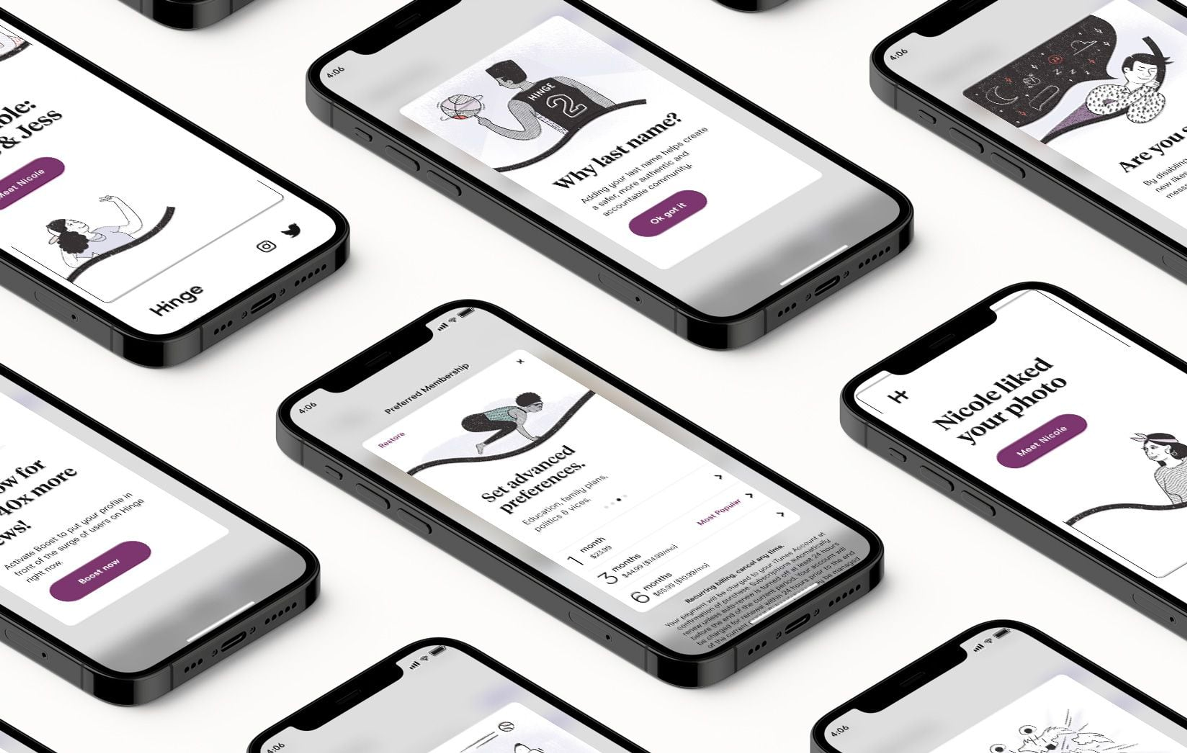
Hinge’s redesigned app focuses on getting people to actually talk and meet, as opposed to an endless game of swiping and ignoring. You can no longer just “like” someone — now you have to at least say hi.
Modern Era Bold, All Caps
Tracking = Metrics, 100
Modern Era Regular, Sentence Case
Tracking = Metrics, 10
1 Week Free Trial $7/Month
Modern Era Bold, All Caps
Tracking = Metrics, 150
Modern Era Regular, Sentence Case
Tracking = Metrics, 10
Most of the time the text should be left aligned, except for a CTA which is generally grounded in the center.
Illustration
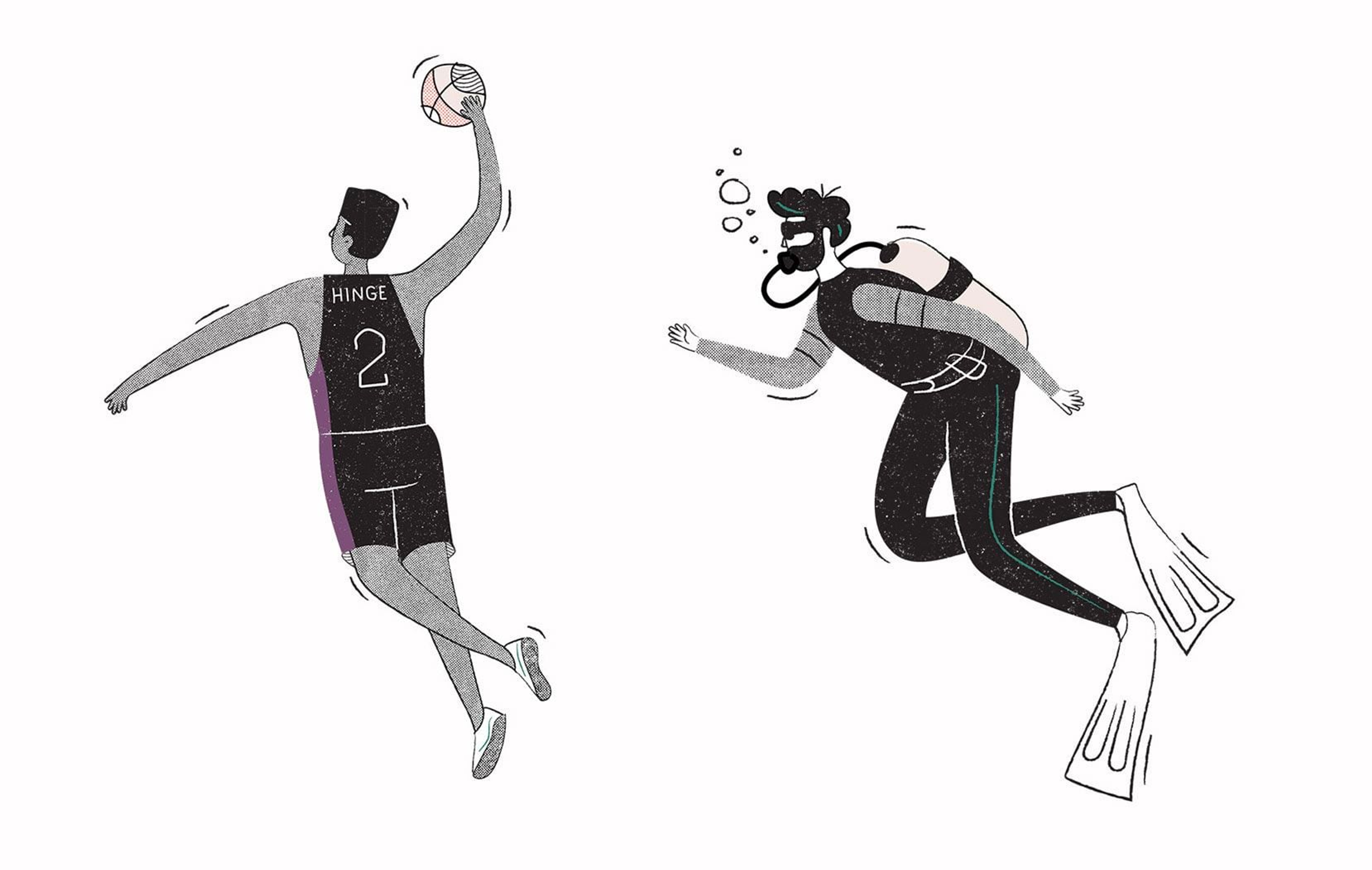
Three words to describe our style are: Human, Distinctive & Imperfect.
Our materials consist of natural strokes and texture fills and how we use these materials is what creates our distinctive style.
This style is derived from the use of meticulously crafted handmade materials, which have been digitized to create easy-to-use swatches and brushes for use in Illustrator.
All of our character bodies start from the same adjustable body rig. This helps to create rubber hose style limbs and consistent proportions when creating new positions.
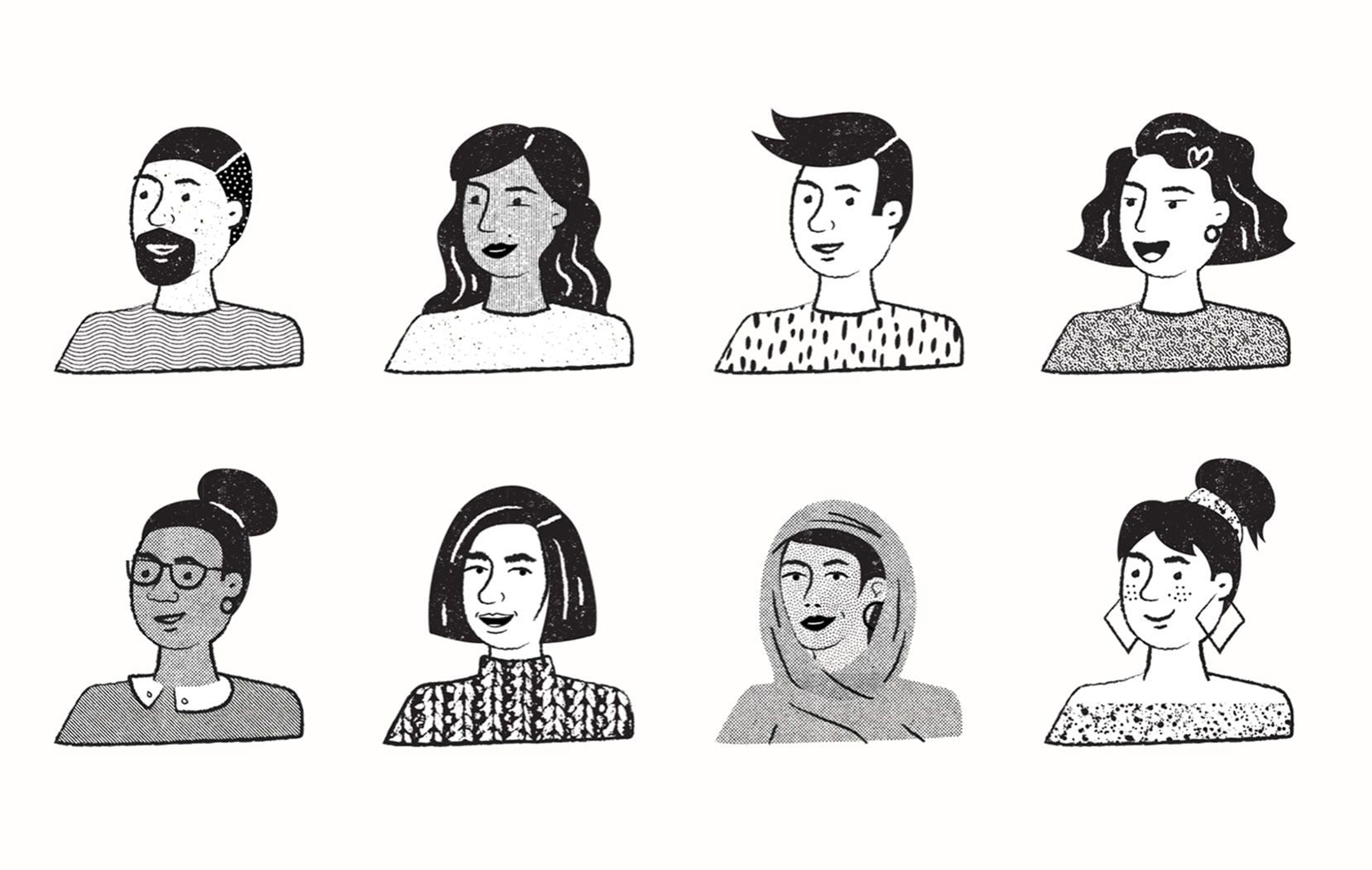
In addition to the body form, facial looks are constructed using interchangeable features. Minimal enough to be replicable and detailed enough to convey individuality.
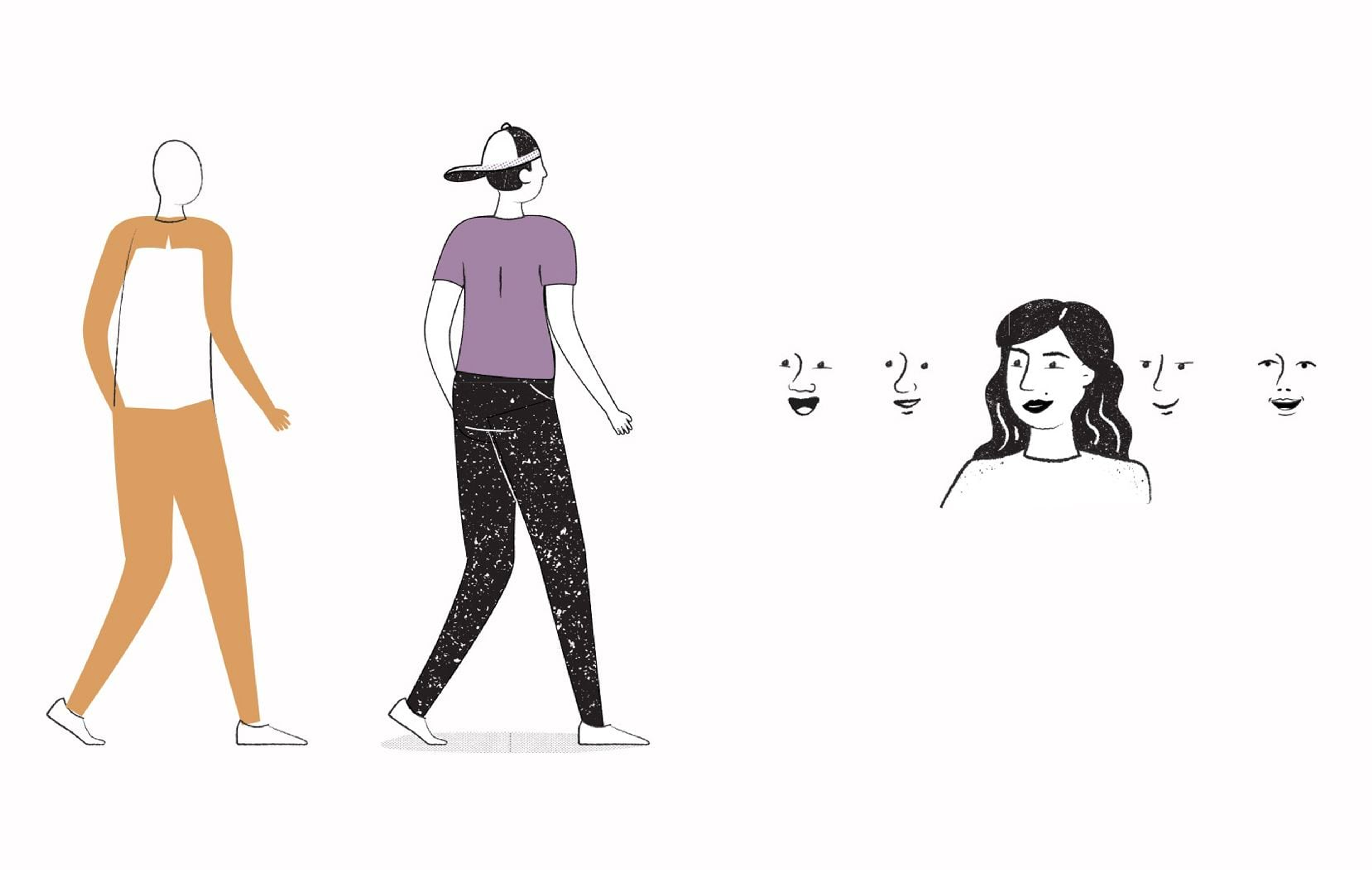
We define a wide range of characteristics found within the human race through thoughtful and considered details. We draw specific individuals with intention and never generalize or stereotype. When choosing these specific characteristics we can also add expression and create emotion. Dating has its ups and downs. It’s important that we are able to empathize.

Color is used sparingly in illustration. Roughly 80% of the defined space of an illustration will be black and white. The other 20% will be defined with color. It’s best to distribute the color evenly throughout the illustration to achieve harmony and balance.
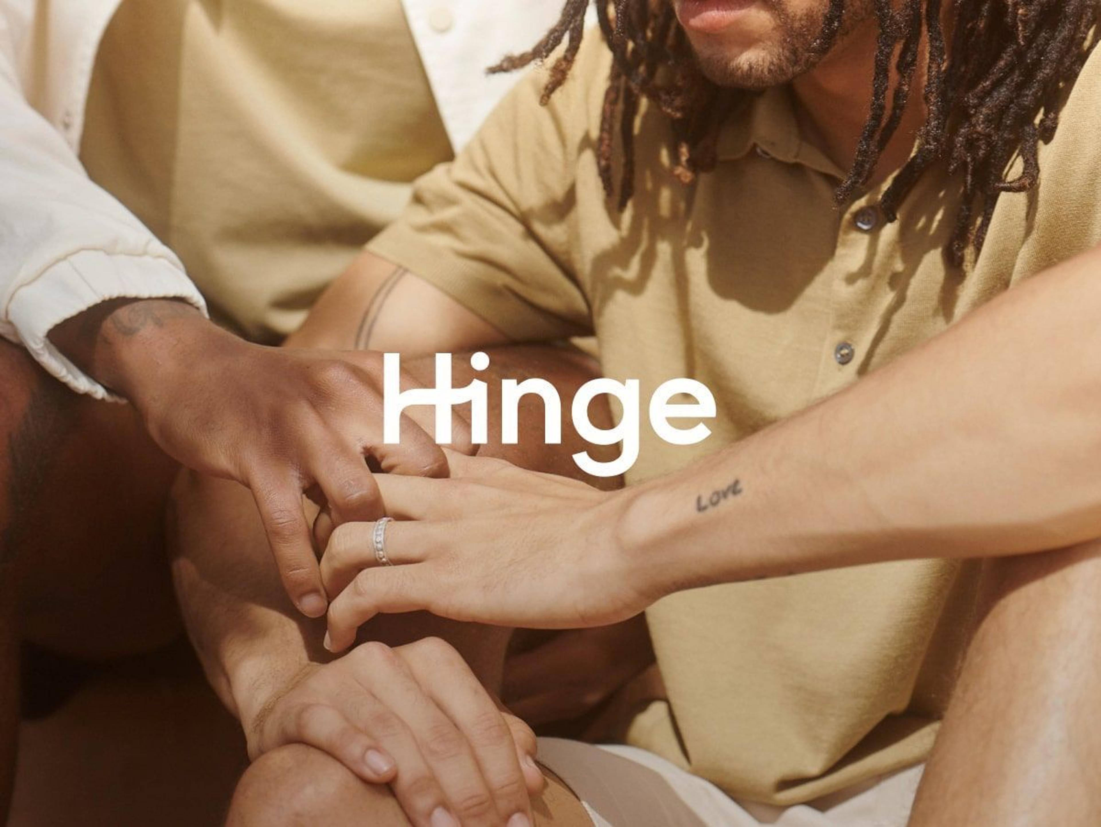
Photography
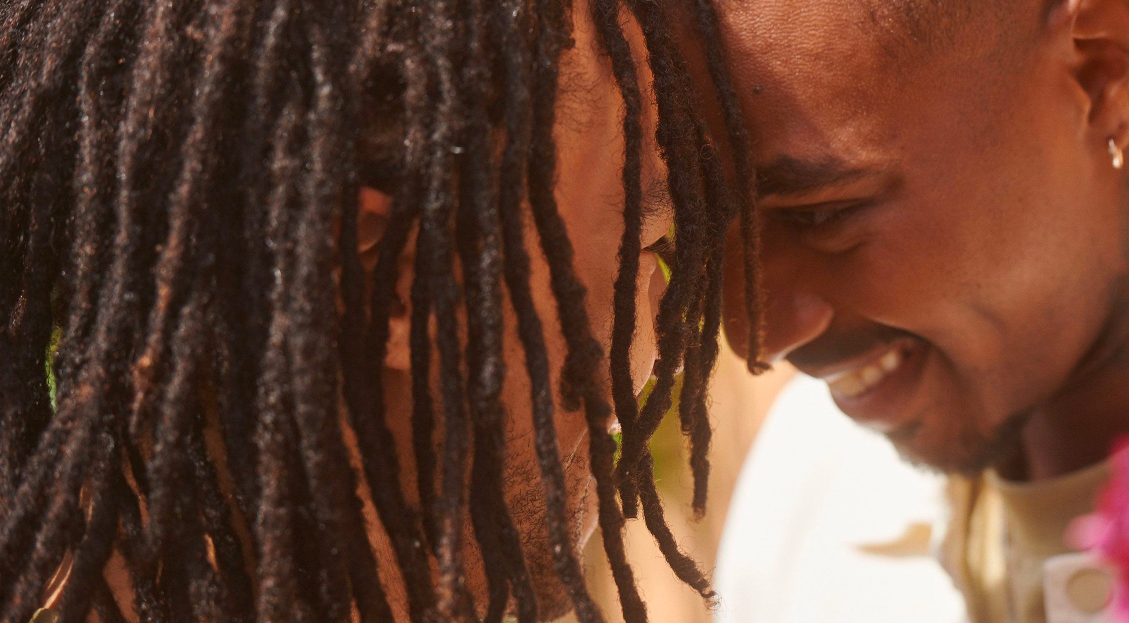
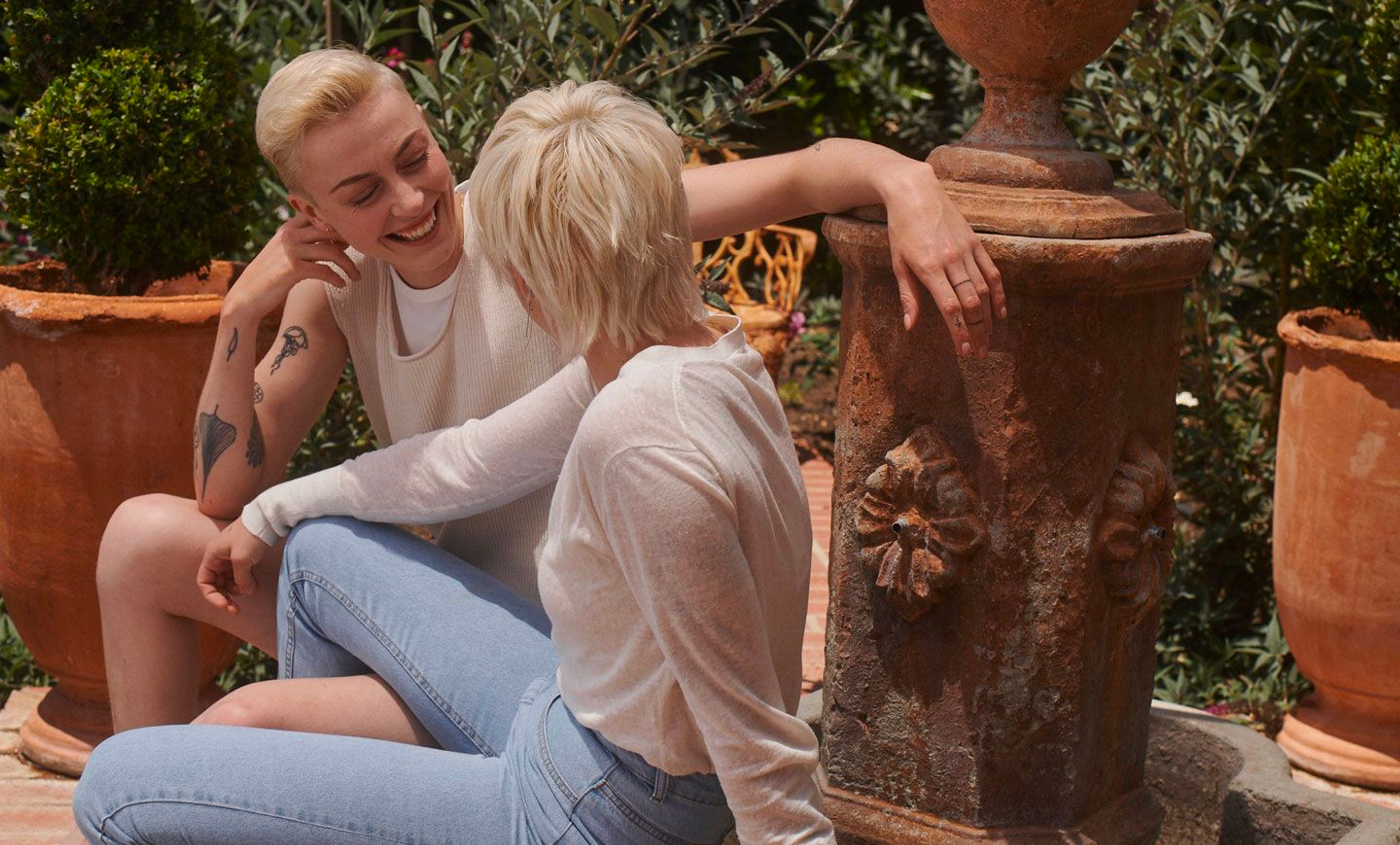
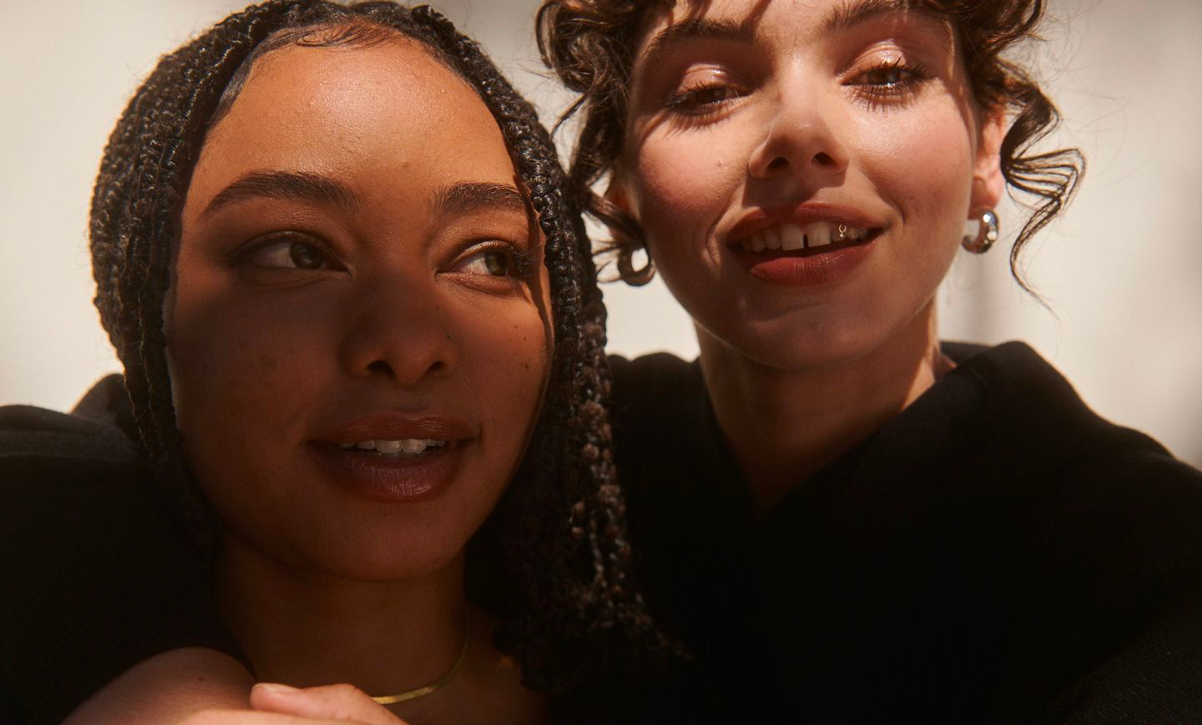
Hinge's photography is honest and authentic. We celebrate emotional intimacy and meaningful connections.
Couples are shown enjoying each other’s company in meaningful ways. Individuals are shown in-between genuine moments of showing off their personality.
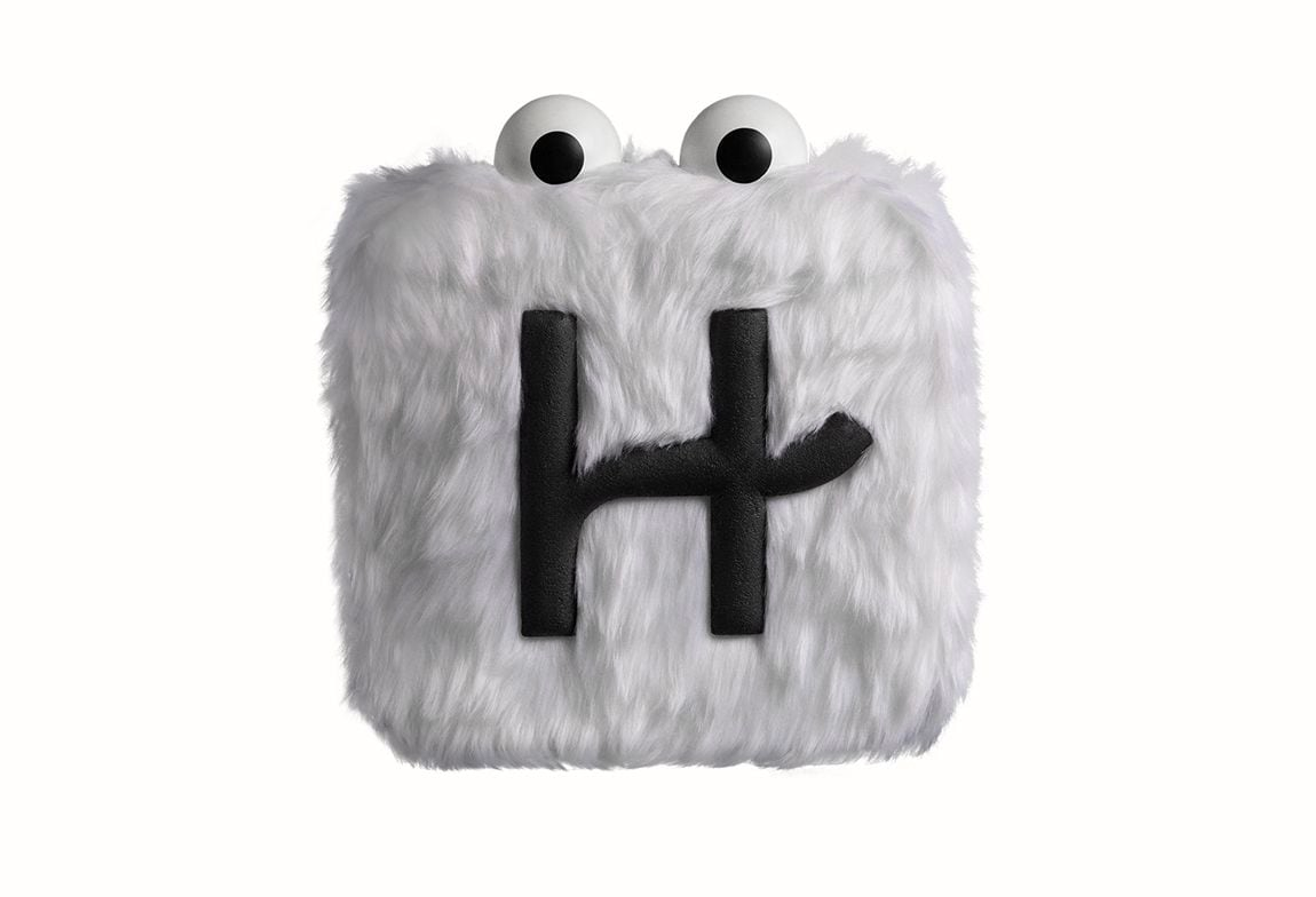
Brand Elements
Hingie is our anthropomorphized app icon who meets his demise every time someone finds love and deletes the app.
He’s the loveable mouthpiece — without an actual mouth — of Hinge when we need to give our audience a helping of some no-filter real talk on all things dating.
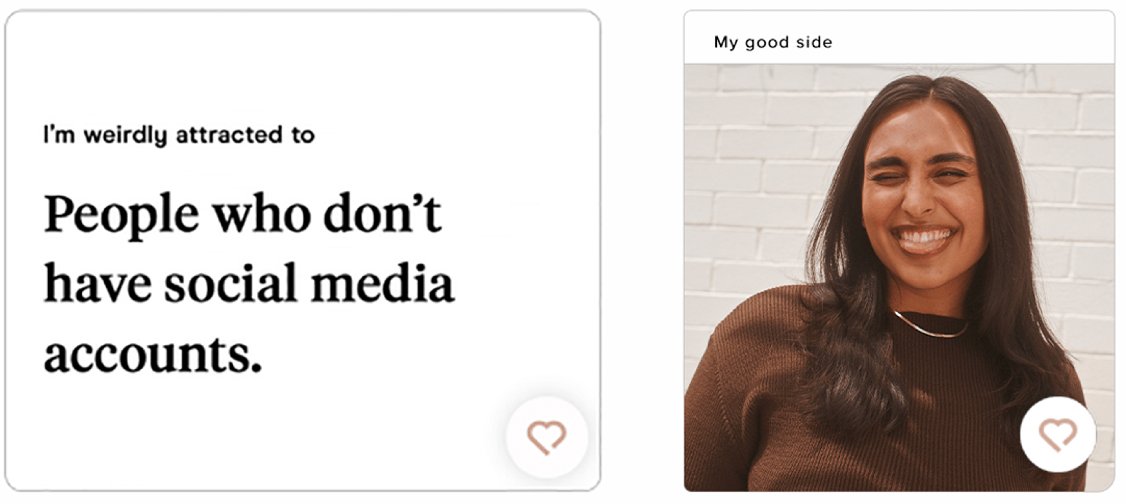
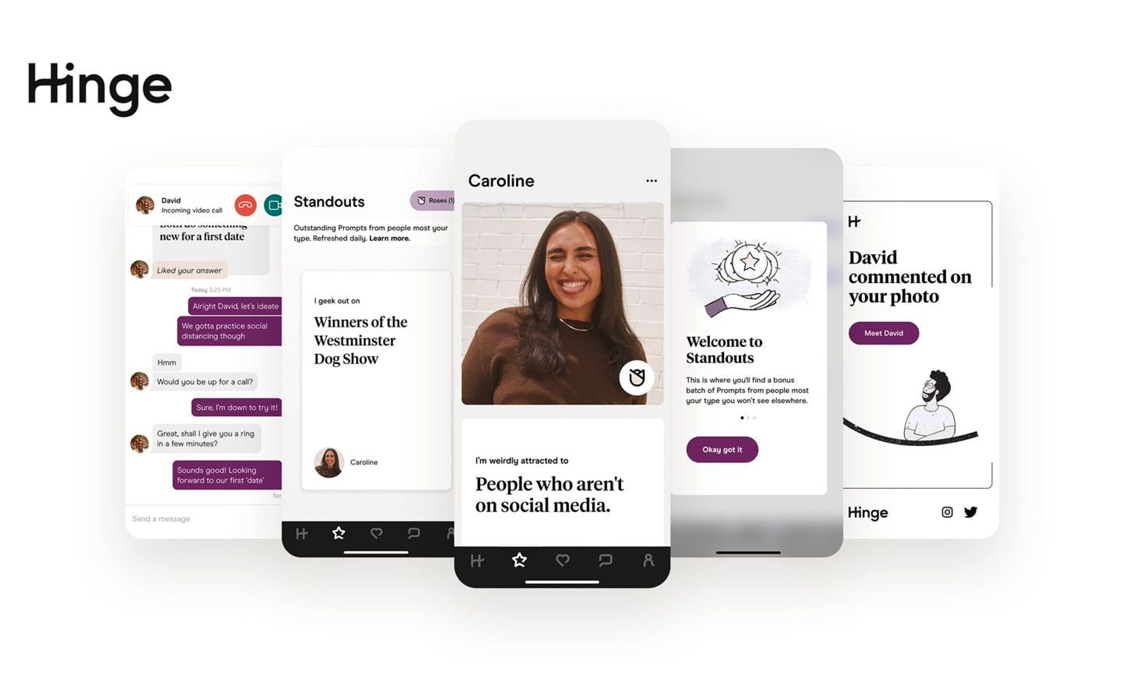
The Prompt is our way of letting our users show others who they are without having to overthink it.
Whether it’s via word, photo, or video the Prompt is a platform for our users to tell prospects who they truly are.